
On my palette
If you were to ask each artist what oil colors should be on your palette you would probably get a different answer from each. Some artists thrive with minimal palettes and others prefer to pack a full rainbow on their palette….
I’m a rainbow gal. A true maximalist at heart, you can certainly create an infinite amount of colors by relying on a minimal palette, I just can’t seem to quite limit myself nor have I really tried to.
However while I do often try new tubes in my painting I do have a few colors that I heavily rely on and are almost always on my palette.
1 - Old Holland Terre Vert
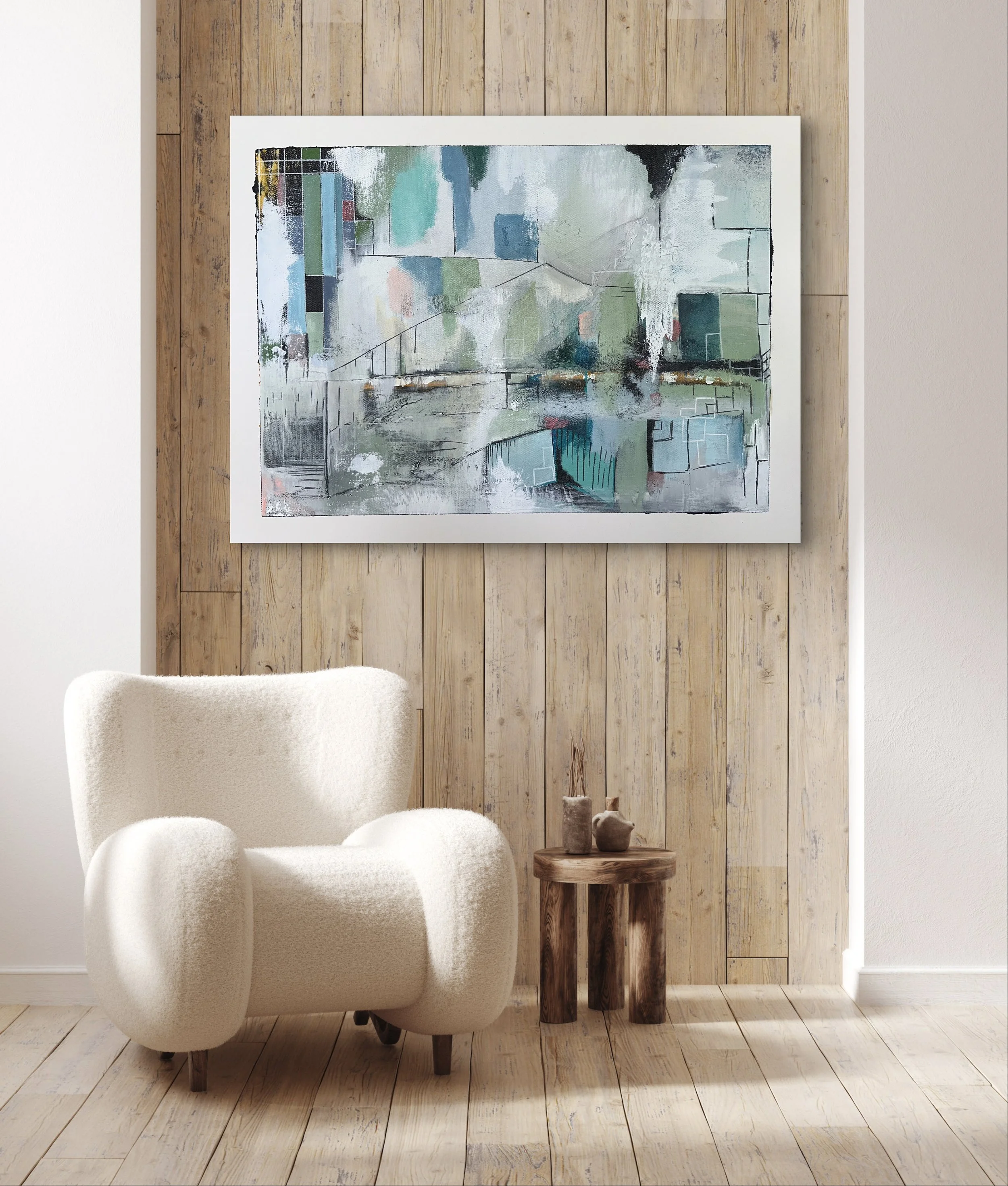
I use this color for just about anything, I use it to mix skin tone, ocean water and I absolutely love it in my abstracts because it is both versatile , semi transparent

2 - Gamblin Radiant Blue -
This is a pre mixed combo of Titanium White And Ultramarine blue I use this a lot for both my skies and my water/ wave paintings and honestly I like relying on this as pre mixed so that I can always count on a constant starting point.

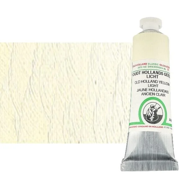
3 - Old Holland Yellow Light
I often use this instead on Titanium white. I use it as is and I use it in my mixes both for landscape and skin tones. It is similar to a titanium buff from other brands but a bit warmer and softer.
I use in my clouds to put in highlights , as well as in my sea foam, in portraits as a warm highlight, It is so close to white but with just enough yellow to carry a touch of warmth. Yes you could easily mix this but it would take a LOT of titranium white and this is just very convenient. Less mixing time equals more painting time.
4- Old Hollan Cadmium Yellow Light
While my actual favorite color is Cadmium Yellow Deep as I love it’s strenght and warmth, I do generally rely on it’s cooler cusin quite a bit , i feel it is more versatile in creating a variety of greens and oranges. I love mixing it with Cobalt Teal and ultramarine blues to get a magnitude of greens , It gives great oranges when mixed with violets such Old Holland Cobalt Violets

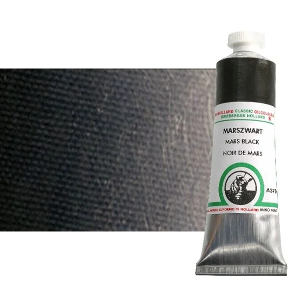
5 - Old Holland Mars Black:
The one thing i was constatly told in art school was never to use black in painting. So it is important for me to make sure I use itin every painting I make, figurative, landscapes and abstract. Could be the goth in me or just the fact it is available . I prefer Mars black to ivory black as it is more neutral, slightly warmer, no blue undertones, it dries fast and it is very matte.